Legal work for humans, by humans.
Merryweather Law founder Constance Liu has spent over 15 years as an estate planning and tax attorney at law firms working with first generation wealth creators as well as families with multi-generational wealth. With a superpower for simplifying the complex and demystifying the arcane, she set out to gently disrupt the legal industry by modeling a new way of doing law: one where attorneys are encouraged to gain exceptional expertise and maintain a sustainable law practice, and clients can get honest and effective legal care.
As a new player in the legal field, Merryweather wanted to establish a brand that resonated with their values and connected with a diverse clientele. The challenge was to create a brand that not only reflected their commitment to clarity and collaboration but also differentiated them in a field often perceived as stodgy, stuck-up and impersonal.
To reflect Connie’s fresh, new approach to legal services, I knew we needed to add a touch of the unexpected — a new take on a traditional concept. Here’s what we did:
Brand discovery and strategy: We began with a comprehensive discovery phase, engaging in in-depth conversations to articulate and gain a deep understanding of Merryweather's vision, values, and target audience. These insights were then refined into a solid brand strategy.
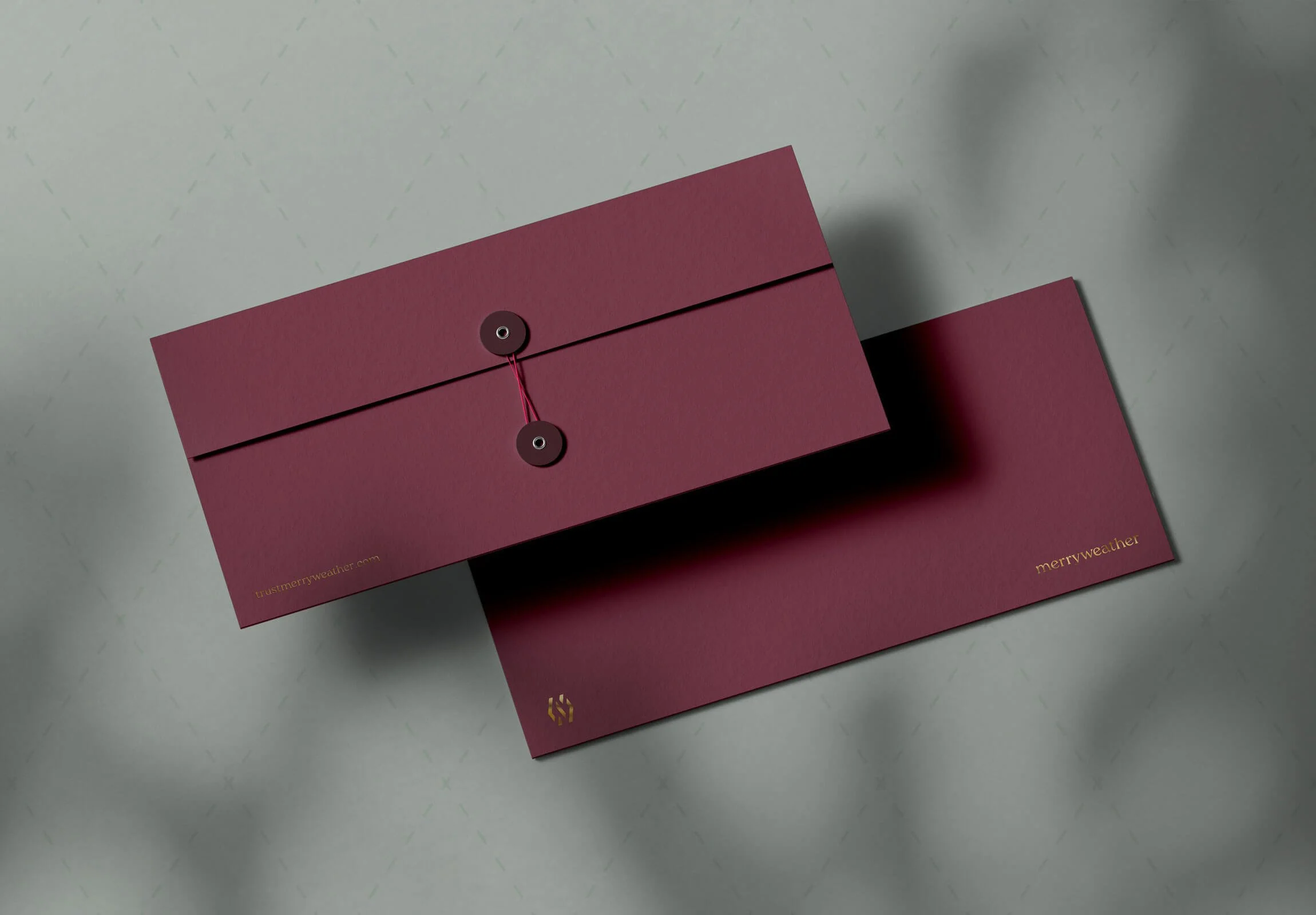
Brand identity: The strategic foundations were translated into a visual brand identity that communicates expertise and trustworthiness, while incorporating subtle and delightful visual surprises for those with a keen eye for detail. The letters "M" and "W" were combined into a simple, but sophisticated monogram. The colour palette features a classic deep maroon, teamed with a burst of berry pink and a touch of elegant gold. An argyle-inspired brand pattern — featuring a dashed pink line — sets Merryweather apart, while nodding to their distinct approach. Typography-wise, the chosen brand typeface is a new take on a classic serif, that upon closer inspection reveals some delightful quirks and details that further support the idea of a gentle disruptor.
The final result is a distinctive brand presence that lets Merryweather shine in an industry known for formality. They now stand as a trusted and approachable choice for estate planning and tax services, making waves in a traditionally formal landscape.
Collaborators:Brand voice & marketing strategy by Rachel Allen, Bolt from the Blue
Website by Week of the Website
As high-income earners and homeowners in their mid-30s to mid-50s, the Merryweathers* prioritise clarity and simplicity in legal and financial matters. Whip smart and appreciative, they value efficient, hassle-free solutions and are frustrated by unnecessarily complicated processes. This is a thoughtful and open-minded couple who respect their family, appreciate good communication, and trust professional advice. They aspire to enjoy life, get things done with ease, and prioritize time with loved ones.
*Of course, the Merryweathers don't exist. We made them up. Based on research, they are a representation of the typical client — and they guide and inform the verbal and visual communication.
Negative space is based on the idea that the human brain often thinks it knows what something looks like and takes over from our eyes to ”fill in the blanks”. By combining the negative space from the initials M and W, we get an icon that at first glance seems abstract, but look closely and your perception of the icon is changed forever — much like people’s perceived idea of a law firm will change once they experience the Merryweather method.
brand position:The gentle disruptor.
The devoted advocate.
The guiding companion.
The argyle brand pattern with the dashed pink line is a twist on tradition — it differentiates Merryweather in a “sea of sameness” and is a nod to their different approach.
Subtle gold details add a touch of luxury.
Incorporating traditional elements, with an unexpected twist, is a recurring theme throughout — like classic string closure envelopes featuring a hot pink string, or a pink wax seal.
The website, expertly executed by the talented team at Week of the Website, features a quirky moving headline, and compelling copy by Rachel Allen.
Comprehensive brand guidelines were designed, to act as a reference for the internal design team, suppliers, and others who are authorised to work with the Merryweather brand. The document includes details about:
Background
Core values, vision & mission
Positioning & target audience
Personality
Messaging & tone of voice
Brand marks & correct use
Typography & colours
Visual assets
Photographic style
Application
Your brand next?
I'd love to help you build a brand that truly represents what you stand for and the vision you have for your business — and the world. When you work with me, you'll get a gorgeous visual brand identity that communicates the essence of your brand and helps you attract + connect with your dream clients. Book a call or find me on Voxer for a chat about your options over a virtual cuppa!


